Patterns are a fun and decorative way to make a statement in your home or office.
Patterns are a visual representation of graphic elements that create a repeating cadence across a material or fabric.
Pattern and texture are two terms that often go hand in hand, but there is a main distinction between the two. The term texture refers to the surface of a material whereas pattern refers to the visual motif that is printed on the material.
While both texture and pattern are wonderful design elements to include in any space, for the purpose of this article, we are going to focus on patterns and how best to incorporate them into the décor.
In this article, we are going to explore some of the best ways to use patterns to make a room come alive!

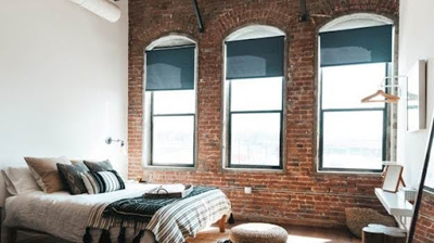
1. Mix Large And Small
Patterns use images, motifs, shapes, and lines in repetition to create a dynamic visual element. Using more than one pattern within a space can be a wonderful stylistic choice when it is done in the right way.
Patterns can be found everywhere in nature in a variety of ways. Some patterns are simple and straightforward while others are elaborate and complex.
The key is to mix patterns that will complement each other and not create chaos.
Picking patterns that use different sizes is a great way to ensure they do not clash.
Start with a larger pattern that utilizes more space in between elements, such as florals or large geometrics. This choice can cover more surface area such as upholstery, floor rugs, or long draperies since it will allow the entire pattern to be seen more clearly.
Then pick a smaller pattern that doesn’t have as much space between the elements, such as a chevron or herringbone. Use this pattern for accents and embellishments such as throw pillows or edge banding on a window shade or drapery.
Are you interested in learning a little bit more about some of these terms and phrases for soft window treatments? Check out our Definitive Guide To Soft Window Treatment Definitions for brief descriptions that can be helpful!
Be sure to include plenty of solid colors and unpatterned areas to allow the eye to rest.
Remember that patterns are meant to be dynamic, so including too many areas of visual interest will quickly become overwhelming.
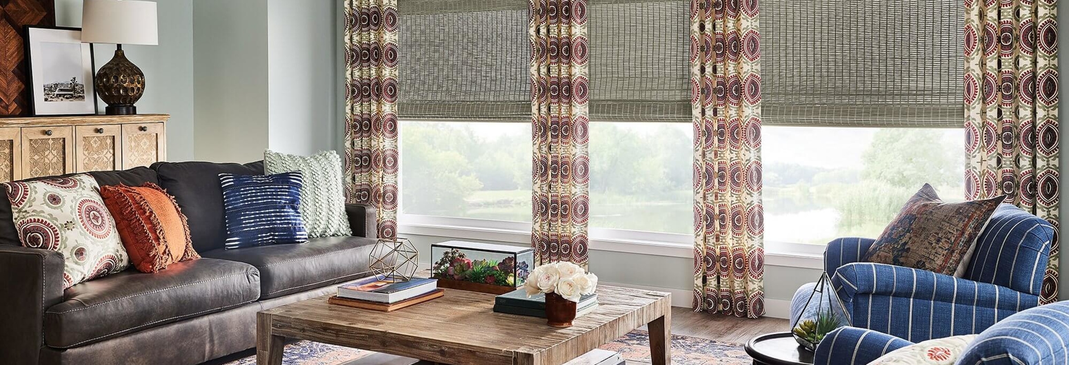
.2105021913066.jpg "When choosing a pattern, stick to the colors that are already in the color scheme of the interior.")
2. Stick With A Color Scheme
Use color wisely when deciding on patterns to add to a room. Too many different colors will clash with one another and make the space feel disjointed and cluttered.
That is not to say that all the prints and patterns must be monochromatic, but keep in mind the colors that are already in use and try to stay within the same tone.
A great guideline is to stick to three colors and use the rule of 60-30-10. Start with one dominant color that covers about 60 percent of the space. Then add a complementary color for about 30 percent of the space. For the final 10 percent, add a fun accent color.
While bold and vibrant colors are fun, be sure to include a neutral color as well. Neutral colors can help to create the ambient feel of a room, so be sure to consider this choice carefully. Whether your neutral color is inherently warm or cool will set the tone for the rest of the space.
For example, consider all the variant shades of white such as cream, eggshell, ecru, or ivory. Each of these shades of white will create a different overall feel to a space. Whites with a variation of yellow added will inherently feel more warm, whereas whites with variation of blue will feel cooler.
Taking into account the amount of natural light that fills the room can also alter the perception of your colors. Big windows with a lot of natural light will make the colors appear lighter and brighter. Those same colors will seem more subtle or muted in a smaller room with less windows, or windows that do not receive direct sunlight.
There are a lot of fun and creative ways to use the different colors that already exist within a space without just picking the main color.
For example, imagine choosing long striped draperies for your windows that are primarily the secondary color of your space and utilize the dominant neutral color for the stripes. The secondary colors get a chance to shine while still pairing nicely with the rest of the room.
Or have fun with the accent colors! Imagine using a solid color for the window draperies and adding edge banding with a fun pattern such as a chevron or herringbone. Let the accent color take the lead in the pattern and let it make a statement.
What about patterns that incorporate more than three colors? Not everything has to perfectly match. Multicolored patterns and prints can still have a place within a room and are great fun to include as well!
Remember the rule of thumb is more of a guideline to keep everything in balance. A touch of other colors or splashes of accent colors are perfectly acceptable as long as the overall tonal quality complements the rest of the space.
The key with color is to create a cohesive look that brings the entire room together. Accents and splashes of color should highlight the visual elements of the space, not clash with one another.
Interested in learning more about using color? Read more in this article 5 Secrets To Simplify Color Selection When Decorating Your Home.

3. Blend Simple With Complex
There is a spectrum of patterns that range from simple to complex. When incorporating more than one print or pattern within a space, it is important to keep in mind how they blend together.
Including too many complex patterns together can make a room feel too busy or distracting. If one complex pattern or print is already in use, then consider incorporating a more simple pattern to provide contrast.
The thing with patterns is that too much of the same thing will dull the dramatic effect or remove it entirely. Patterns and prints should be used as flourishes and enhancements, not as the primary theme of the room.
Using more than one pattern is not a problem as long as each one contributes something to the overall look and feel of the room.
Consider damask edge banding on a window valance with matching throw pillows in the same room as an area rug featuring a harlequin or ogee pattern. The simplicity of the pattern on the area rug does not outshine the busyness of the banding and pillows. Instead they can complement each other and work together to draw the eye around the room.

4. Create Contrast And Balance
The visual nature of patterns is to create contrast while maintaining balance between the colors, shapes, and motifs.
The same principle applies to the room as a whole. Adding visual elements should enhance the stylistic choices in the room and bring everything together cohesively.
Bringing more than one pattern or print into a room can be a fun way to add visual stimulation but it should not be overwhelming.
Use contrasting colors, lines, and shapes to let each pattern stand out on its own. Picking all the same lines or shapes within a print or sticking with similar color tones will just make everything blend into each other. Contrast is what will make each choice distinct and interesting.
At the same time, there needs to be balance within a space. Visual balance will create a harmonious atmosphere that can be seen and felt. Balance does not necessarily mean everything matches perfectly, but ensures that the entire space feels complete.
Have fun playing with all sorts of different patterns and prints, keeping in mind how they work together. Design is all about finding the right balance of contrast and harmony and this is true for using patterns as well.

5. Know When To Say No
Great design is accomplished by knowing when to stop. As much fun as patterns and prints are, there is wisdom in knowing what not to include.
Limit the number of different patterns within a room. More than one pattern in a space is completely acceptable as long as there is some space in between.
Remember that the eye needs places to rest to avoid overstimulation. If there are too many patterns in one room, it will feel chaotic and overwhelming.
Start with two patterns that fit the descriptions we have already discussed. If there is a place for more, consider carefully how these other patterns will play into the room. Honestly consider what these other patterns or prints are adding to the space and if they are necessary.
Are they enhancing the interior style or are they just being thrown in. After careful consideration, they may be a better fit in another area of the house.
Saying no to certain choices can end up being just as important in the overall development of a room. Pick and choose what makes the most sense for each space. Allow enough time to really get a feel for the room with and without the design elements you are considering.
Pieces that you may love right at the beginning, may end up not being your favorite. Or vise versa. Start with a “less is more” approach and then slowly add to it. Enjoy giving your room the space it needs to breathe and then decide what design elements to bring into the mix. The final results may end up surprising you.
Conclusion
Patterns are a wonderful addition to a space. Using patterns strategically will add color and visual dynamics to any room.
The trick is to use them to complement the other colors and materials within a space. Combining too many patterns can make the surroundings feel too busy and chaotic, so knowing when to stop is key.
At Gotcha Covered, we love finding ways to incorporate just the right patterns into your custom window treatments! Let us help you get started on a path to find the perfect combination of patterns to take your room to the next level!
Call us at (888) 650-6187 or schedule a free design consultation online right here today!