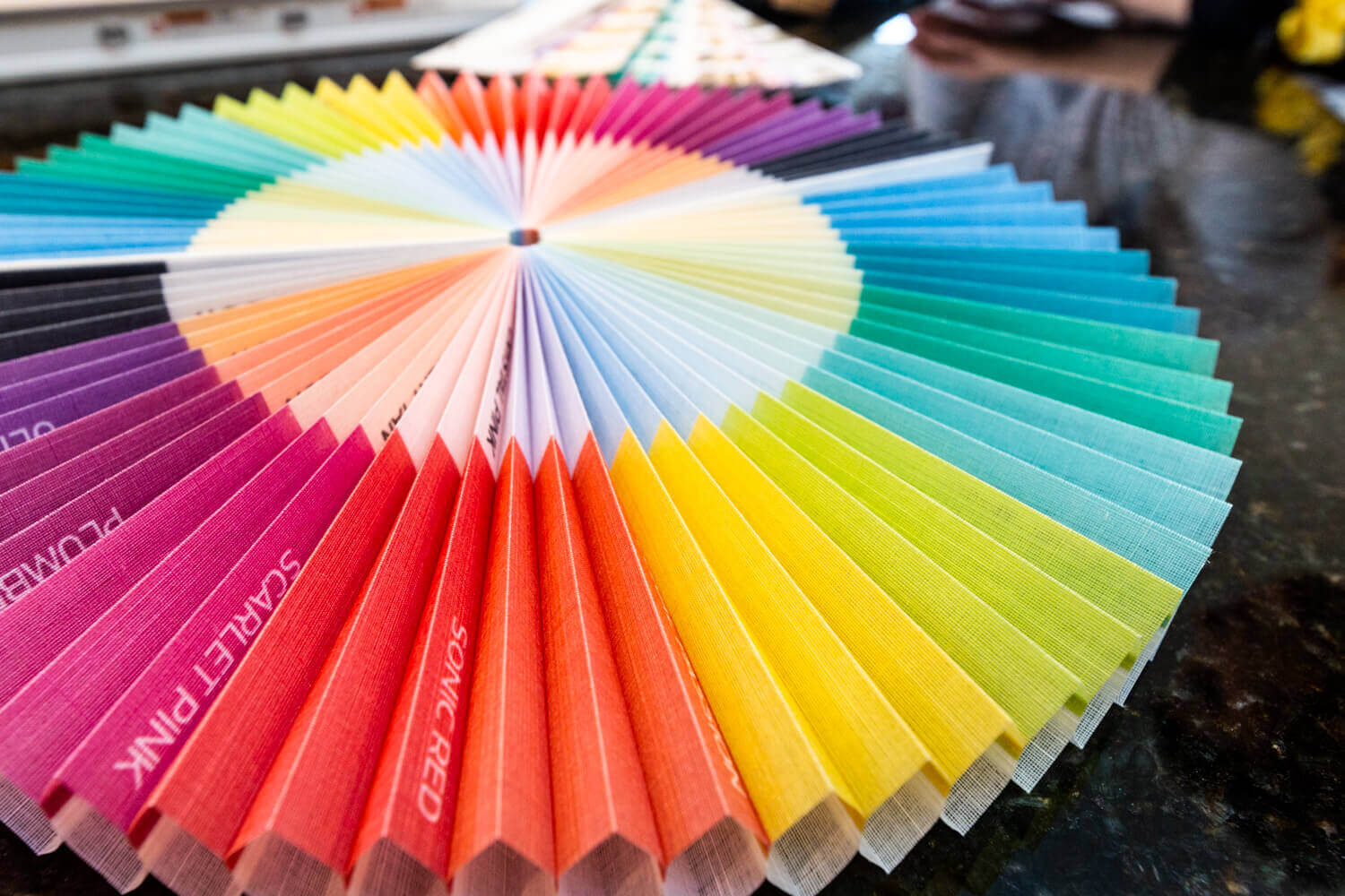
There’s nothing like a little color to really bring life into your home. When decorating the rooms in your home, color selection is a pivotal piece to the puzzle and will be reflected in all aspects of your rooms, including your window treatments. The trick is finding the right color schemes to fit your mood, decor, and lifestyle and using those palettes to complement your home or work place.
In the world of design, the first rule is that there are no rules. But there are some guidelines to follow that will help narrow down the vast selection of color choices available.
We highlight five of these guidelines that will help you determine the right colors for your home:
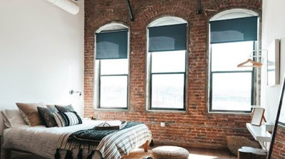
 Secret #1 - Follow The Rule Of 3
We are breaking the rules by calling this first secret a “rule” but that’s what is so wonderful about design - the rules are made to be broken! The Rule of 3 refers to limiting the color palette of any space to three colors. Again, remember, this is more of a guideline, not a hard-set rule. By limiting the color palette to no more than three colors, those color choices can make a bold statement instead of competing with all the other colors of the room.
The Rule of 3 also gives you the chance to let the colors play off one another. If the first two colors of your palette are pure hues, or primary colors, consider a muted color as the third choice. Combining a bold color with a muted color provides a great dynamic that will draw the eye around the whole room.
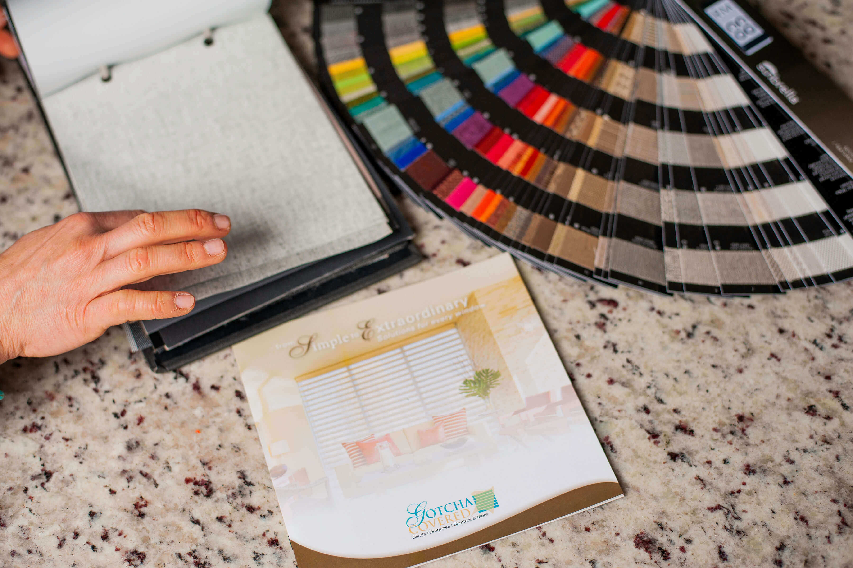
When determining the colors of your window treatments, consider all three colors of your palette. Window treatments come in a wide variety of color options. If you have already selected the color choices for your space, be sure to consider all the color options for your window treatments. You might be pleasantly surprised at what each color will add to the room.
Through Gotcha Covered, we have a huge assortment of window treatment and color options. You can even browse through our idea gallery to get some inspiration.
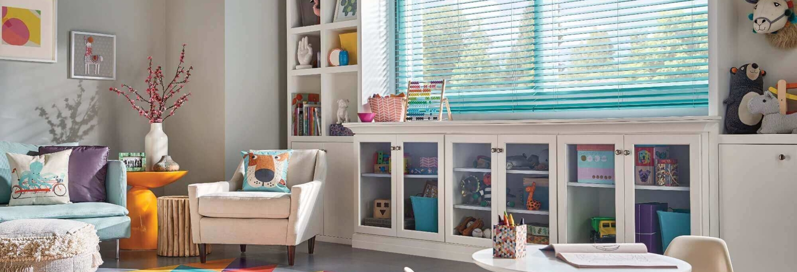
Secret #2 - 60-30-10
The next guideline for color selection is the ratio 60-30-10. This ratio refers to the percentage of the space dedicated to each color choice. When assigning colors to different parts of the room, 60% should be the dominant color choice, 30% the secondary color choice, and 10% an accent color. And since this is a guideline, not a rule, there is no need to measure out these exact percentages. Simply keep the proportions in mind when determining what colors to use throughout your space.
- The dominant color choice should cover about 60% of your space such as the walls, floors, or any other large surface area within the room. Whichever color you choose as your dominant color should be reflected throughout the majority of the space.
- The secondary color choice should cover about 30% of your room. Consider this color choice for the furniture, area rugs, larger statement pieces, or even an accent wall. The secondary color will add contrast. Any color can be used as the secondary color choice as long as you like it and it works with the dominant color.
- The accent color is for the remaining 10% of the room. This is the color choice for any accessories or wall decorations. The accent color is the flair for your space, so have fun with it. Bright or bold colors are typically what we think of when talking about accent colors, but that is not always the case. Black can be a dramatic accent color choice. Pastel or metallic colors are some other fun choices to consider as an accent color.
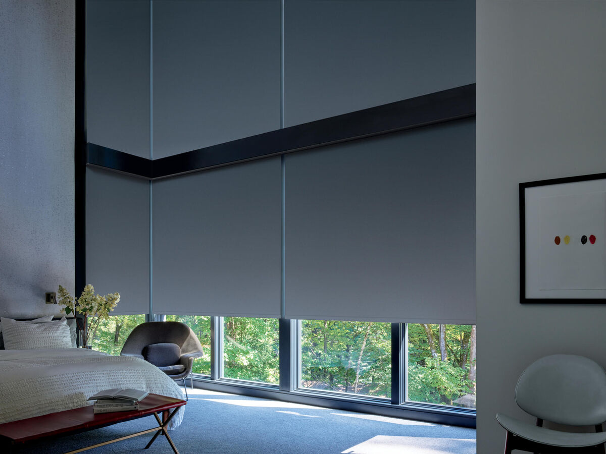
Window treatments can fall under any one of these three color categories. Perhaps you want your window treatments to match the dominant color choice of the room. This might work best for window treatments on sliding doors or large windows that take up the majority of a wall.
Many times, the window treatments are the secondary color choice since they are complementing the dominant color. Window treatments are a wonderful way to complement the color of the walls or floors and a fun way to match the furniture of a room.
Or your window treatments can be the accent color of the room. This works especially well if you are using fabric window treatments with patterns that maybe have just a splash of the accent color. The fun thing about using window treatments as an accent is that there are so many options.
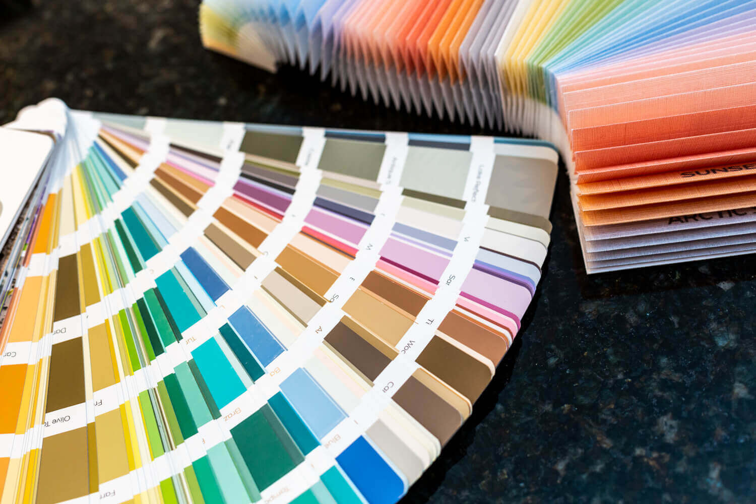
Secret #3 - Use The Color Wheel
The color wheel is a visual representation of colors according to their chromatic relationships which makes this the perfect tool for creating your ideal color palette for any space.
Colors next to each other on the color wheel are going to be similar in shades and tones which will create a soothing, relaxed atmosphere. When decorating a room where you want to have a relaxing atmosphere, such as a bedroom, study, or bathroom, consider choosing colors that are near each other on the color wheel.
Colors that are across from each other on the color wheel are complementary colors. They are going to create a more energetic and engaging atmosphere. When decorating rooms that will be used for entertaining or gathering together, such as the living room, dining room, or kitchen, consider using a color palette that includes a complementary color choice.
To learn more about how colors on the color wheel work together to create balance and contrast, check out this article from The Spruce.
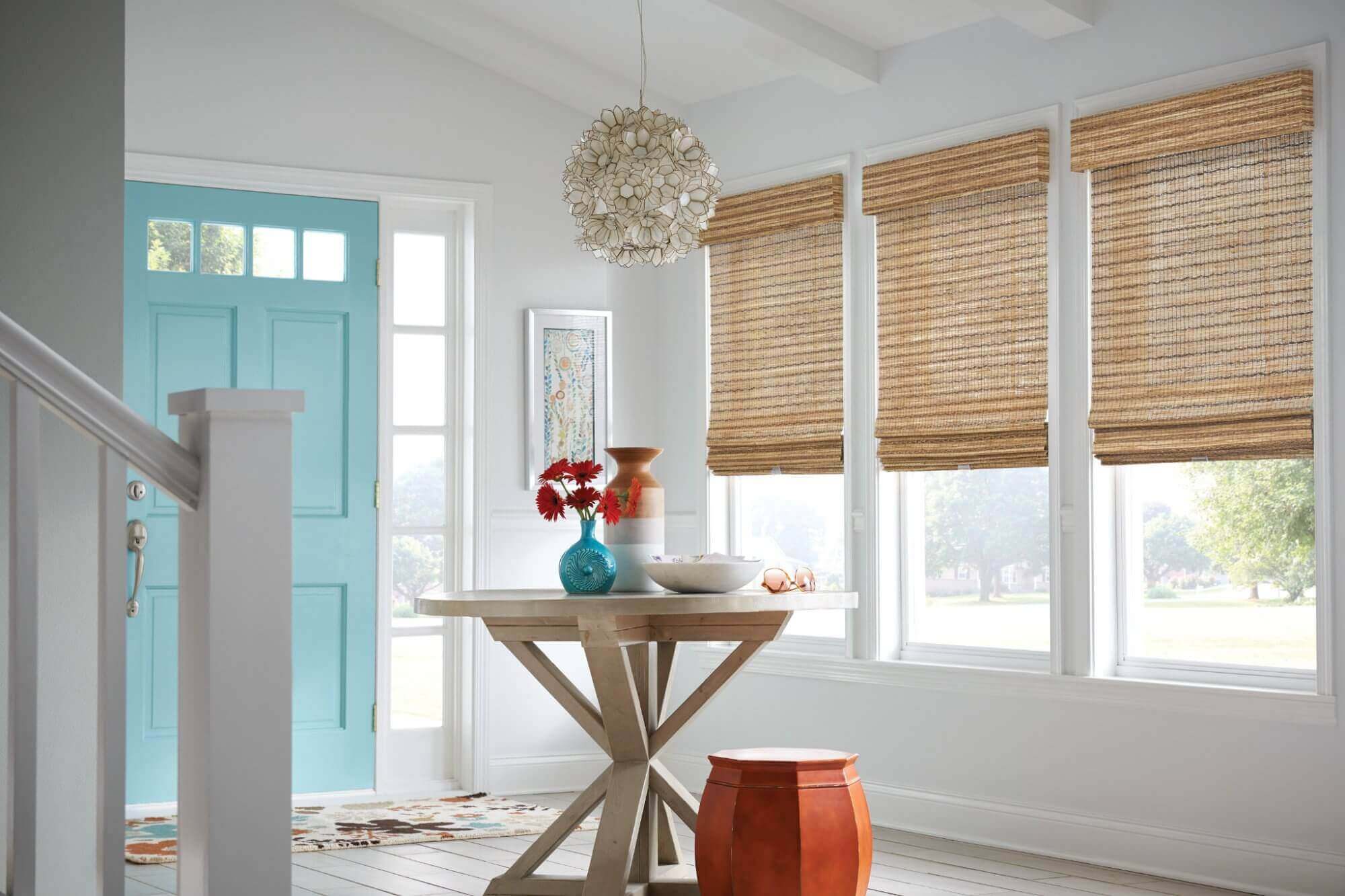
Secret #4 - Decorate From Dark To Light
When decorating the interior of your home or work place, try starting with the darker color values towards the floor and lighter color values towards the ceiling. This gradual lightening of colors as you work your way up vertically mimics the color scheme of the outdoors. The outdoor world begins darkest under our feet and gets lighter as our eyes travel upwards towards the sky. This creates a smooth transition for our eyes.
When darker colors are used up high with lighter colors below, it can make a room feel top-heavy. Deeper shades used down at the bottom of a space actually help to ground the lighter colors used above.
There is no set rule for where your window coverings should fit in this color scheme. Just be aware of the colors you are considering for your window treatments and how they will come into play in the overall vision of your interior.
Secret #5 - Make Your Space Reflect The Real You
At the end of the day, your living spaces and work spaces should feel like you. Even if you follow all the “rules” but you don’t let your own personality shine through, your space will lack authenticity and not feel right. Decorate honestly and people will respect your unique style and flair.
A great way to pinpoint what color palettes fit naturally with you is to take a cue from your clothing. You tend to wear clothing in colors that appeal to your taste and style, but also that make you feel comfortable and good about wearing. Those are great colors to start with when deciding what colors to surround yourself with in your home.
No one else will decorate exactly like you. Adding personal touches from your own life experiences and personality will make your space unique to you. You will be the one spending the most time in these spaces, so be sure to make it something that you will enjoy.
Conclusion
Window treatments are a wonderful way to add a splash of color to your living spaces. Colorful window coverings are a great way to complement or add an accent to the color palette of your rooms. Color is a wonderful addition to any room on its own or in a pattern. Or, if your rooms are already full of colors, a neutral colored window treatment can add a soothing place for the eye to rest. Whether they are bringing a splash of color, adding a playful pattern, or creating a soothing neutral tone, window treatments are a great way to bring your style and personality into any living space.
When it comes to window treatments, the number of color choices available can be overwhelming. Working with a Gotcha Covered Designer will help you narrow down the options and pinpoint colors that will match and complement your decor. Whether you are redesigning your whole room or just upgrading your window coverings, your Gotcha Covered expert will be ready to jump in and give you some pointers.
If you are ready to add more colorful window treatments to your home, be sure to reach out to us at (888) 650-6187 or schedule a free design consultation!
 About the Author: Brooke Carr, Gotcha Covered
Brooke joined the Gotcha Covered family in 2018 as the Social Media Coordinator. She works closely with our corporate teams and our Gotcha Covered franchisees to develop insightful and helpful content for our brand.