Think of color as a rambunctious toddler - fun and playful, but it doesn’t take much for it to take over and make a mess of everything!
Color is a fantastic addition to any area of design, especially interior design, but it must be handled with intention and forethought.
Here are some great questions to ask yourself before adding colorful accents to any space!

Question #1: What Is My Intention For Adding This Color?
Adding a color or an accent piece to a space should be done with a clear intention. Be sure to consider what this particular choice brings to the room. Is it intended to be purely decorative or does it add functionality and comfort?
If done right, everything included within the space should provide a level of both function and decoration.
Furniture pieces should be purposeful, comfortable, as well as aesthetically pleasing to look at. How it is arranged should also complement the space to create a well functioning environment. While the color of the piece may be a perfect match, if it is not comfortable, or does not fit well in the room, you may want to pass.
Wall hangings and floor coverings will primarily serve a decorative purpose but when chosen properly, they can provide a function by pointing to the style of the owner and what they find meaningful. Colors should be a consideration, but keep in mind that sometimes less is more. A piece that is predominantly the color you want to showcase may be overwhelming in the space.
Accessories such as throws, pillows, or lamps serve to add a level of comfort but can definitely be incredibly decorative. Other items such as books, photo albums, picture frames, or display pieces are more decorative but should also reflect the owner’s interests and hobbies. Feel free to use the color choices already in the space, but consider using little hints or touches of the color rather than huge splashes of color.
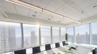
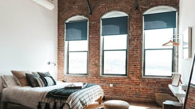
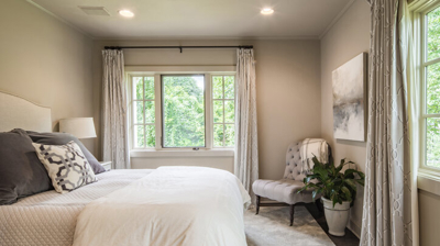
Window treatments are a fantastic way to add a decorative touch and embellish the interior design style while providing light control, temperature control, and privacy. When done properly, window treatments become an integral piece of the room.
All different styles of window treatments are available in a wide variety of colors. Rather than making everything all the same color, consider mixing and matching different tones and hues.
Off setting certain colors will help create focus and intention to the entire space. Don’t be afraid to layer window treatments with different colors and incorporate complementary patterns and prints. For more ideas on how to play with patterns and prints, be sure to read our article Exploring Patterns To Make A Statement.
When it comes to color selection, be sure to follow the Rule of 3. The Rule of 3 is really more of a guideline, not a rule, and refers to limiting the color palette of any space to three colors.
By limiting the color palette to no more than three colors, those color choices can make a bold statement instead of competing with all the other colors of the room.
The Rule of 3 also gives you the chance to let the colors play off one another. If the first two colors of your palette are pure hues, or primary colors, consider a muted color as the third choice. Combining a bold color with a muted color provides a great dynamic that will draw the eye around the whole room.
Before deciding on what to bring in, ask yourself what do I expect this particular choice to add to the space? Is there a specific need to address or is it more of a stylistic choice? Determining the purpose of the accent pieces being included will help to narrow down the choices. Then decide on the look and style that speaks to you and reflects the style you want.

Question #2: Does This Color Play Nice?
When selecting color choices for a space, it is important to look at how they work together. Do they balance well with the other colors already in the room?
We are not saying that everything has to match. In fact, that may be the last thing you want. Instead, look at how the color choices complement or contrast each other. Contrast is not necessarily a bad thing as long as it is done carefully. In fact, contrasting colors can create a very dramatic effect.
Complementary and contrasting colors refer to placement of each hue on the color wheel. The color wheel is a visual representation of colors according to their chromatic relationships which makes this the perfect tool for creating your ideal color palette for any space.
Instead of focusing on making everything match, take a moment to look at how they flow. A good rule of thumb is to place everything together and then move back approximately ten feet. From there evaluate the pieces together and see how they look.
Does something strike you as out of place? If so, perhaps it would be best suited somewhere else.
If everything meshes well and looks cohesive, then you are on the right track! Don’t be afraid to add a little bit of the unexpected! These can become wonderful conversation pieces to include in your space.
Another important factor to keep in mind is using the right ratio of colors. A good guideline is to follow a ratio of 60:30:10.
When assigning colors to different parts of the room, 60% should be the dominant color choice, 30% the secondary color choice, and 10% an accent color. And since this is a guideline, not a rule, there is no need to measure out these exact percentages. Simply keep the proportions in mind when determining what colors to use throughout your space.
The dominant color choice should cover about 60% of your space such as the walls, floors, or any other large surface area within the room. Whichever color you choose as your dominant color should be reflected throughout the majority of the space.
The secondary color choice should cover about 30% of your room. Consider this color choice for the furniture, area rugs, larger statement pieces, or even an accent wall. The secondary color will add contrast. Any color can be used as the secondary color choice as long as you like it and it works with the dominant color.
The accent color is for the remaining 10% of the room. This is the color choice for any accessories or wall decorations. The accent color is the flair for your space, so have fun with it. Bright or bold colors are typically what we think of when talking about accent colors, but that is not always the case. Black can be a dramatic accent color choice. Or if your dominant and secondary colors are already darker hues, consider using whites, metallics, or pastels as the accent color.
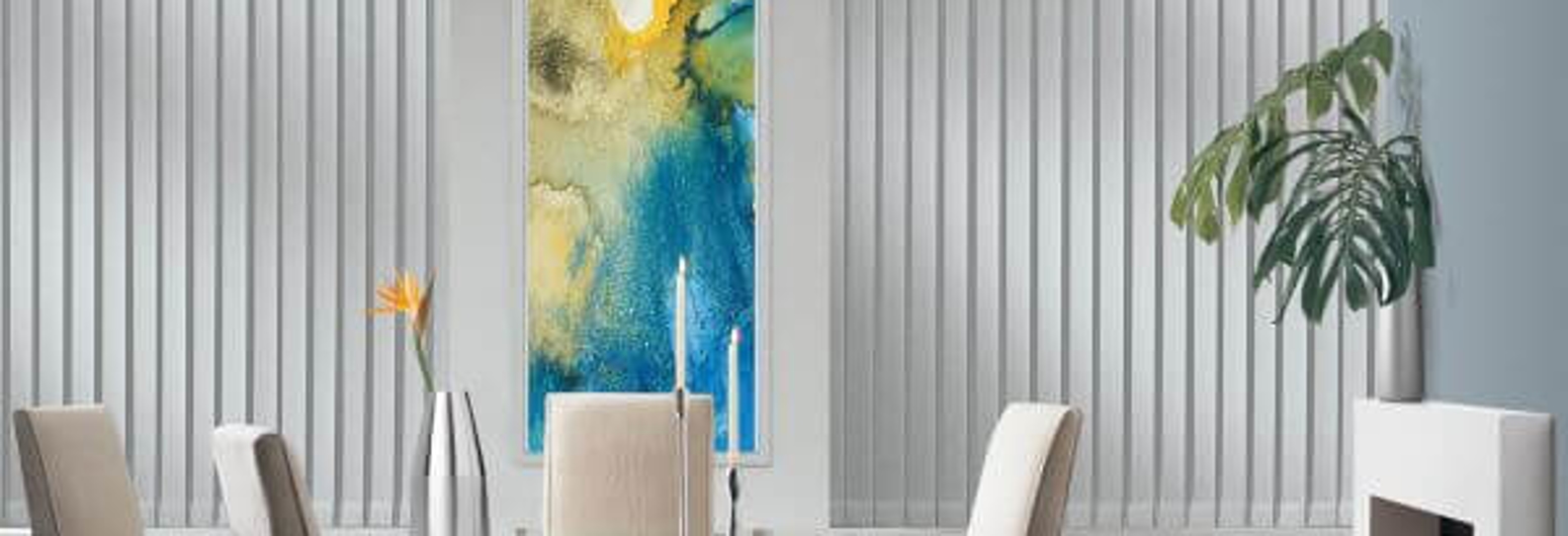
Window treatments can fall under any one of these three color categories. Perhaps you want your window treatments to match the dominant color choice of the room. This might work best for blinds or shades that you want to blend in and not draw attention to.
Window treatments can also follow the secondary color choice and help to complement the dominant color. The secondary color will help them stand out against the walls and create a beautiful design element around the windows. Window treatments are also a wonderful way to complement the color of the walls or floors and a fun way to match the furniture of a room.
Or your window treatments can be the accent color of the room. This works especially well if you are using fabric window treatments with patterns that maybe have just a splash of the accent color. Decorative banding, edging, tassels, or fringe can also be added to a more neutral soft window treatment that picks up the accent color of the room. The fun thing about using window treatments as an accent is that there are so many options.

Question #3: What Feeling Does This Color Bring To The Space?
Colors can evoke specific emotions, so incorporating the right color choice into a space is going to help determine the atmosphere and mood.
Colors are broadly categorized as warm or cool which refers in part to the feeling they evoke. Warm colors are found on one side of the color wheel which includes reds, oranges, and yellows and are associated with the sun, fire, and energy. Cool colors are on the opposite side of the color wheel and include blues, purples, and greens and are associated with feelings of calm and relaxation. Neutral colors can be either warm or cool depending on the undertones of the hue.
Typically, colors found next to each other on the color wheel are going to be similar in shades and tones which will create a soothing, relaxed atmosphere. When decorating a room where you want to have a relaxing atmosphere, such as a bedroom, study, or bathroom, consider choosing colors that are near each other on the color wheel.
Colors that are across from each other on the color wheel are going to create a more energetic and engaging atmosphere. When decorating rooms that will be used for entertaining or gathering together, such as the living room, dining room, or kitchen, consider using a color palette that includes more dynamic color choices.
Home offices can present a unique dilemma when it comes to determining the right type of décor. On the one hand, a place of work should be calm and relaxing in order to lessen any stress. On the other hand, if your workplace is too relaxing, it may be a challenge to stay productive. Creating a more stimulating atmosphere may be a better choice for a home office to add a little excitement and help make the work day more enjoyable.
For more great ideas on how to improve your workplace, be sure to read 5 Tips To Make Your Home Office A Place Of Productivity And Efficiency.
At the end of the day, your living spaces and work spaces should feel like you. Even if you follow all the rules, but you don’t let your own personality shine through, your space will lack authenticity and not feel right. Decorate honestly and people will respect your unique style and flair.
A great way to pinpoint what color palettes fit naturally with you is to take a cue from your clothing. You tend to wear clothing in colors that appeal to your taste and style, but also that make you feel comfortable and good about wearing. Those are great colors to start with when deciding what colors to surround yourself with in your home.
No one else will decorate exactly like you. Adding personal touches from your own life experiences and personality will make your space unique to you. You will be the one spending the most time in these spaces, so be sure to make it something that you will enjoy.

Question #4: Should This Color Be Added Anywhere Else?
Before adding something new to your space, ask yourself if it will look isolated or out of place on its own. Bringing in a new color choice can definitely add a new dimension to the area, but be sure of the intention behind it. Is it meant to be a statement piece and stand out on its own or do you want it to fit in with the rest of the space?
That’s not to say that a brand new piece can not be incorporated if it doesn’t fit quite right. It may just mean that some alterations or additional pieces may need to be incorporated as well.
For example, adding floor length draperies may be the perfect addition to large picture windows. If those panels are a color that is already present in the room, not much may need to be changed. Say these panels are a new color choice to brighten up the space. Perhaps adding matching throw pillows or an area rug that has a similar color scheme will help to make the entire room look cohesive.
There is nothing wrong with adding a new color into the mix. Just be sure it is done with a plan in place and not just haphazardly.
Introducing a new color choice in one room, may even spill over into the rest of the house. Adding a splash of this new color in other areas of the house is a fun way to tie the décor all together.
Conclusion
Don’t be afraid to add color to your space! The right accents will improve your mood and boost your energy. When you are happy and experience a sense of wellness in your own space, it will show.
Window treatments are a fantastic way to add an accent to your home or office. At Gotcha Covered, we have a vast selection of window treatment options and styles to fit your needs.
Our design team are experts at finding just the right solutions and getting you the window treatments you’ve always dreamed of.
Be sure to schedule your complimentary design consultation by calling (800) 650-6187 or schedule an appointment online right here and see what our team can do for you!